Sculpted by the breton climate
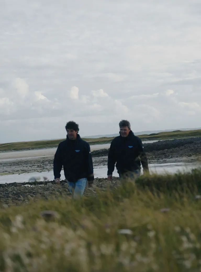
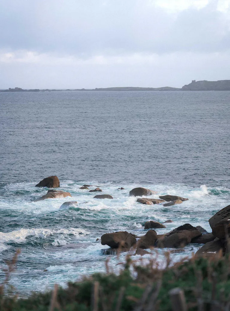
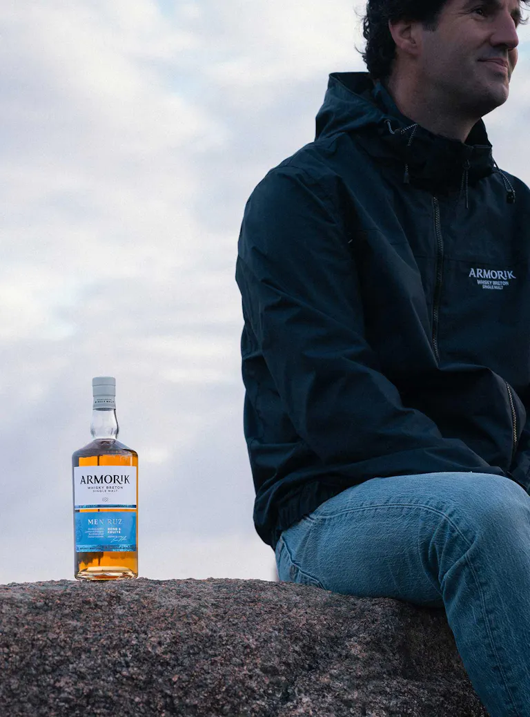
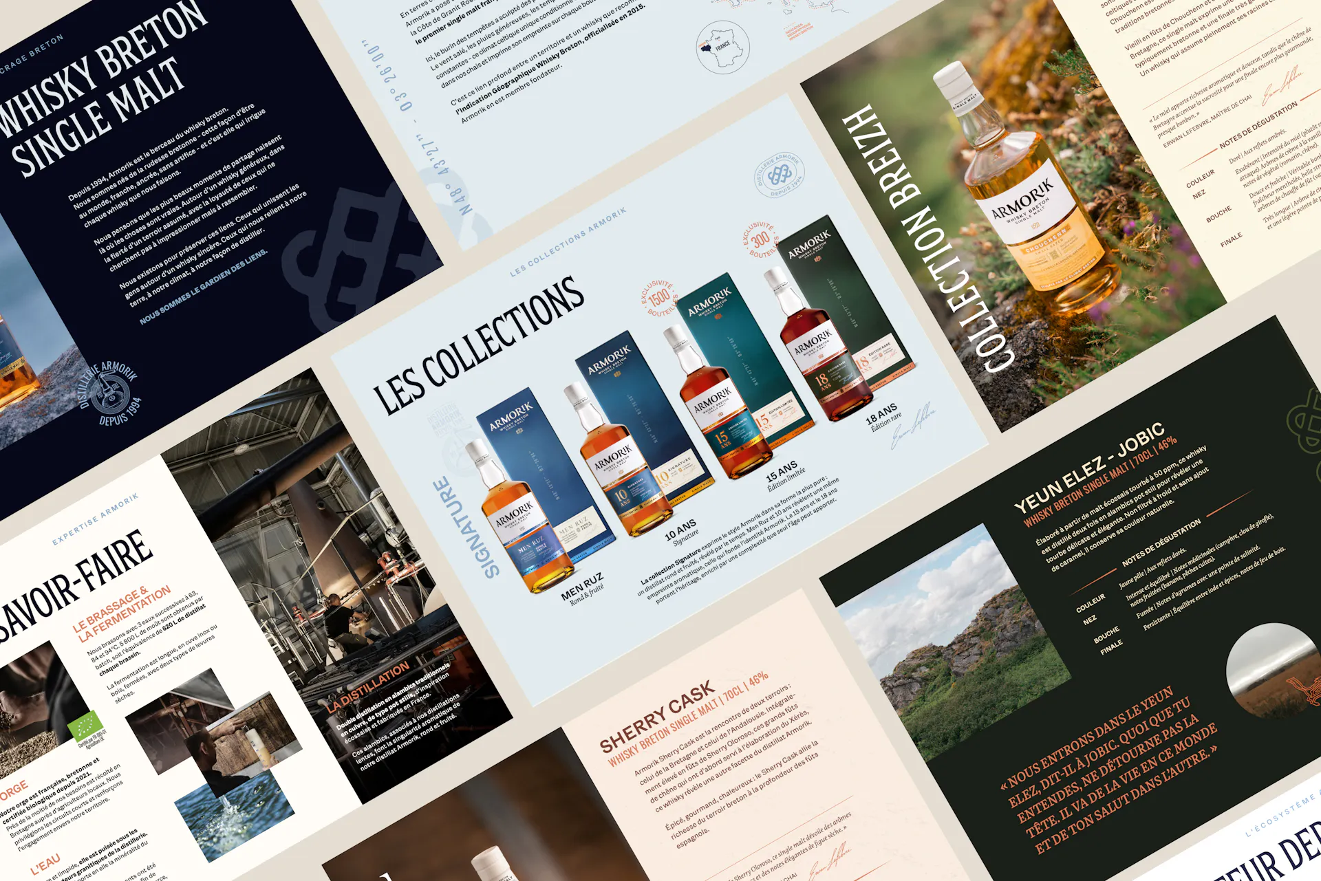
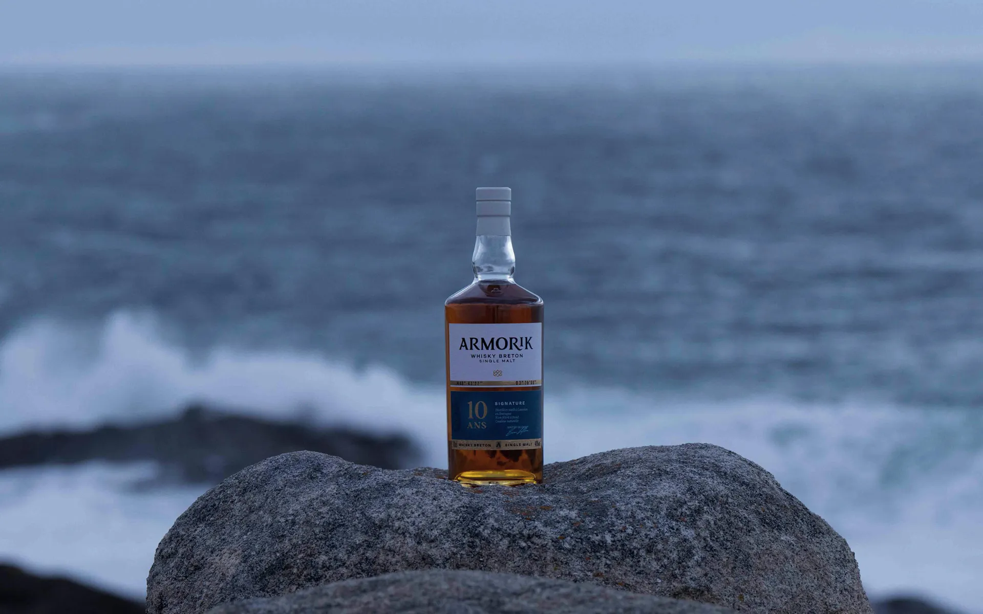
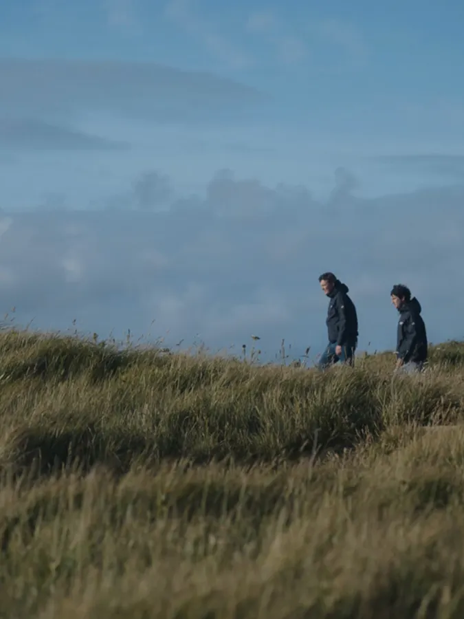
The brand’s new identity reveals this singular character through a world of expression directly inspired by Brittany and its elements. An environment shaped by the sea, the wind, and the land.
Sculpted by the breton climate becomes far more than a signature: it is the expression of what has shaped Armorik’s character since its origins. This guiding thread has informed every artistic choice behind the brand’s new identity.
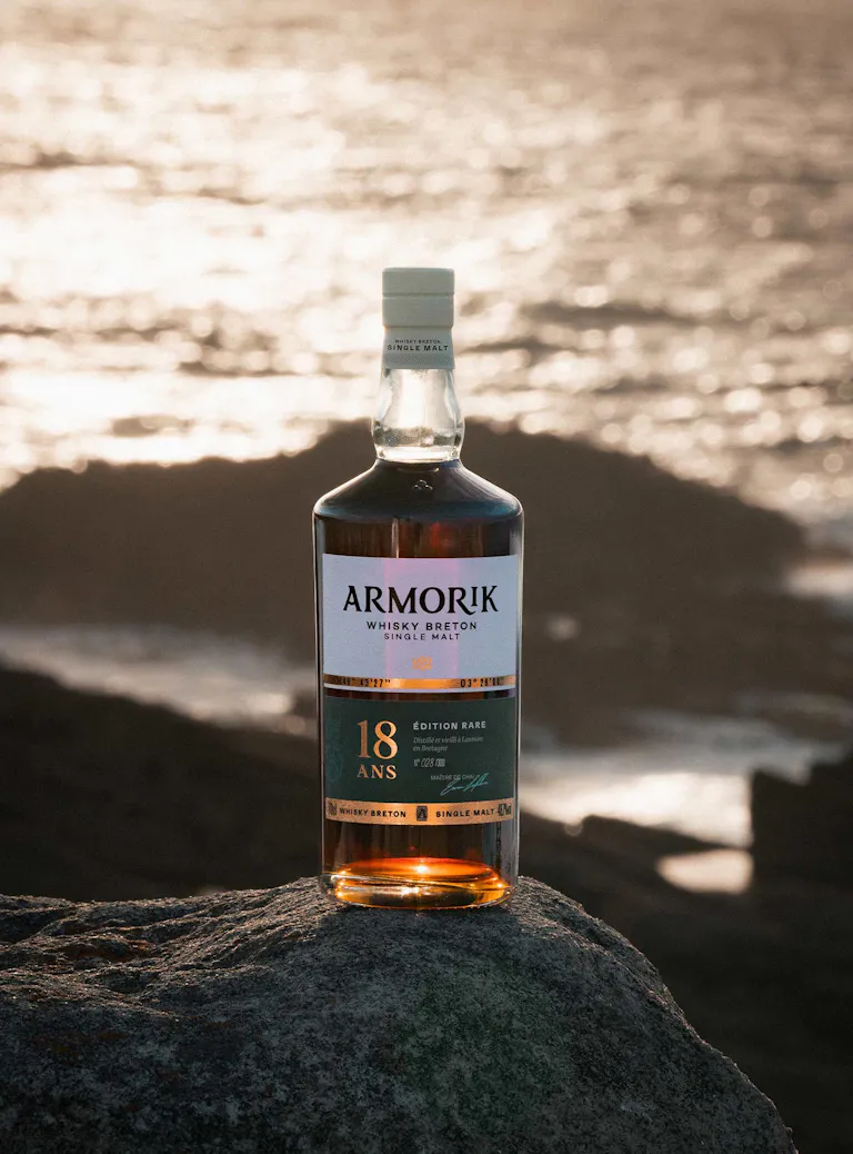
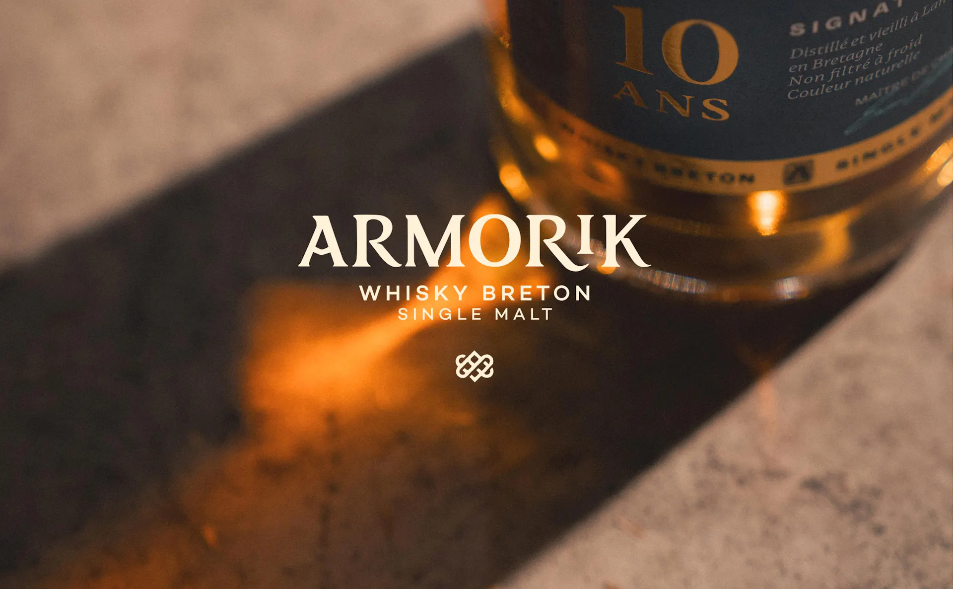
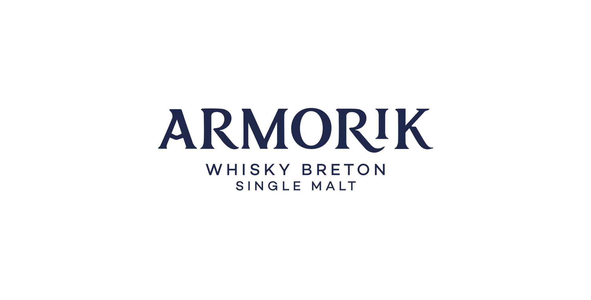
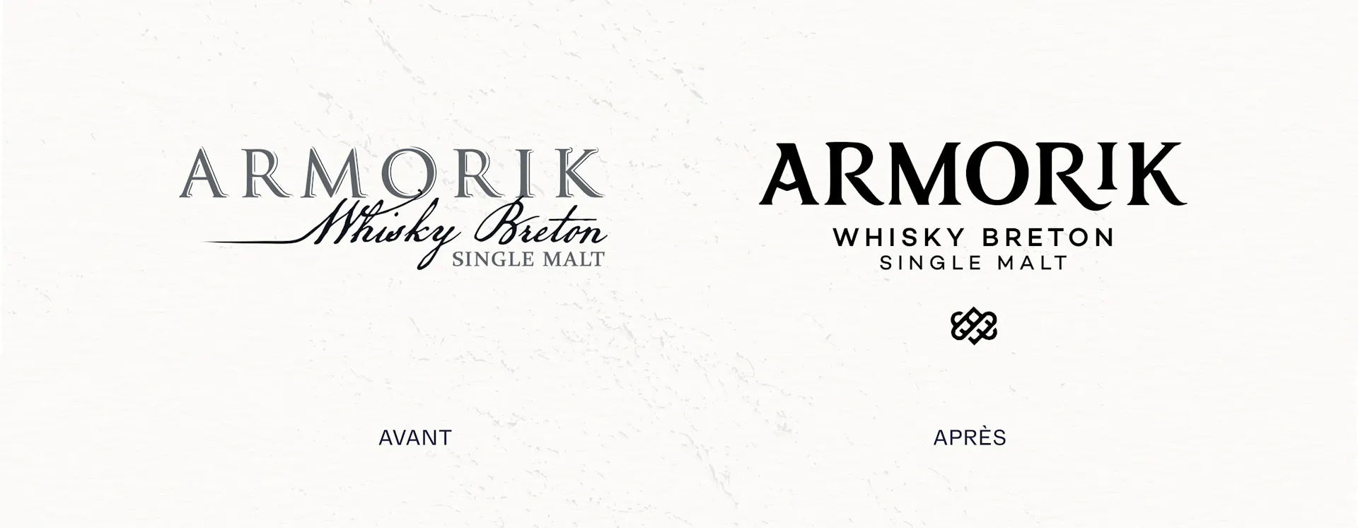
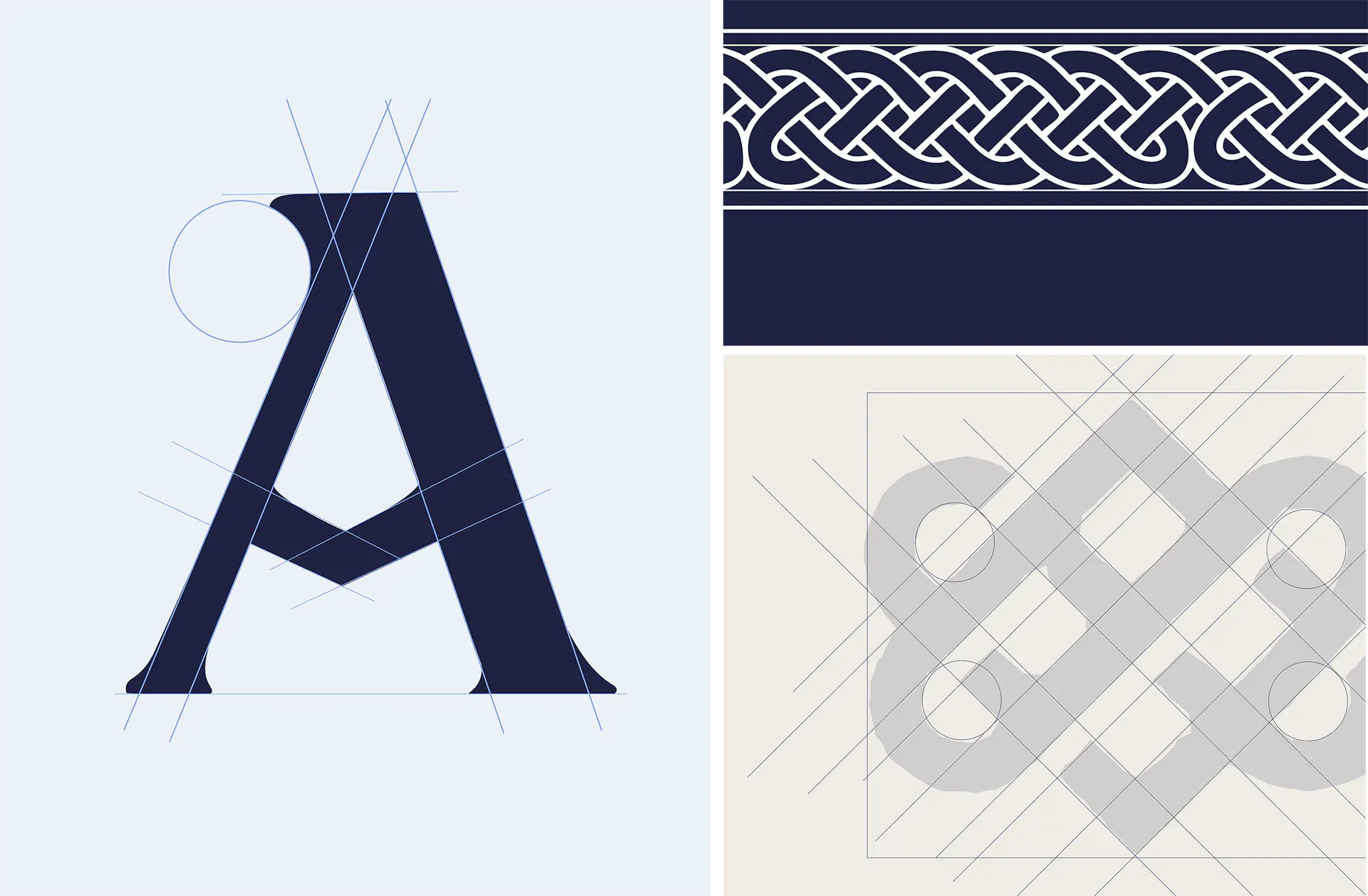
A brand mark entirely redesigned to express, through its very form, Armorik’s character and origins. Drawing inspiration from the study of runic symbols and ancestral scripts, the typography reinterprets traditional letterforms through a more contemporary design.
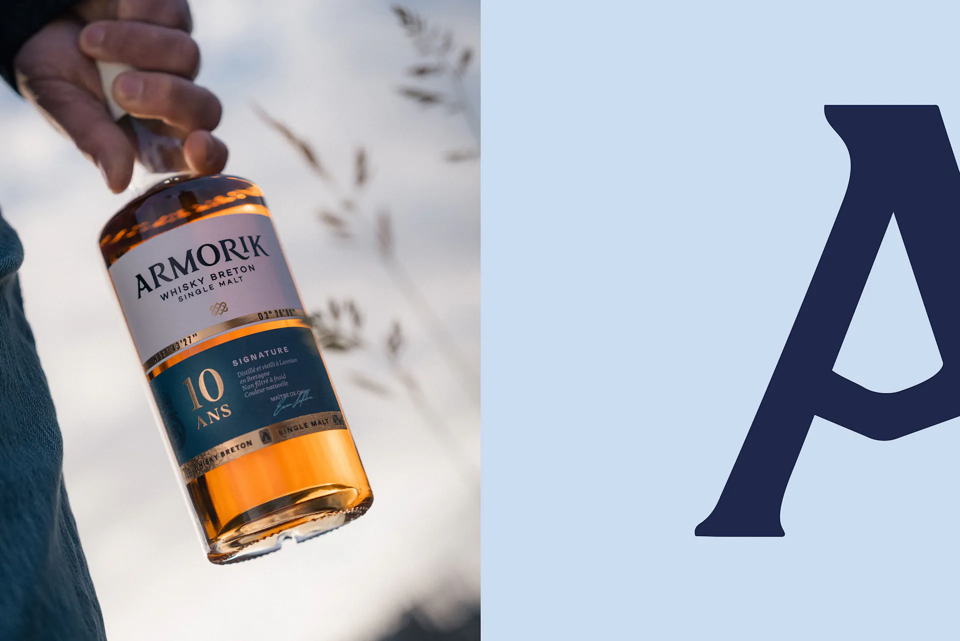
More contemporary details subtly challenge this heritage, creating a visual expression that bridges past and present: an identity that draws from the past while firmly belonging to the present.
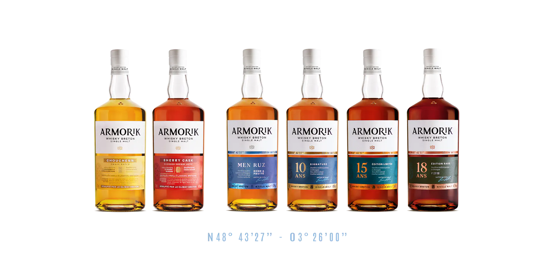
Colour becomes a language in its own right: bold, natural and vibrant. It interacts with the transparency of the glass, light and texture, inviting discovery and tasting while maintaining a strong and consistent brand identity.


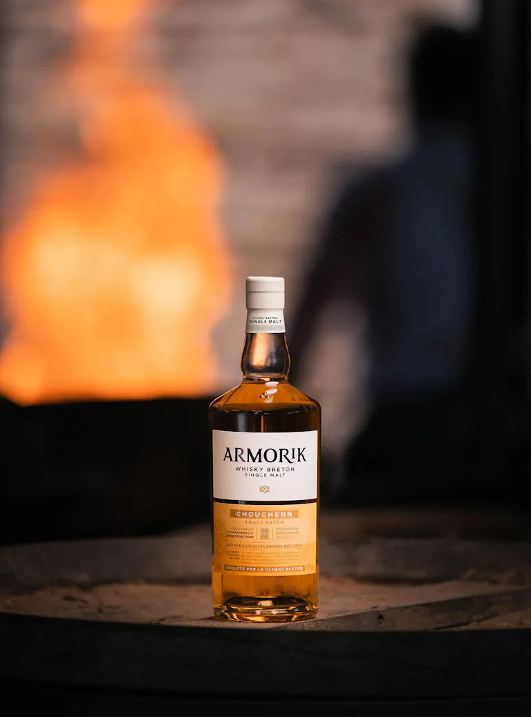
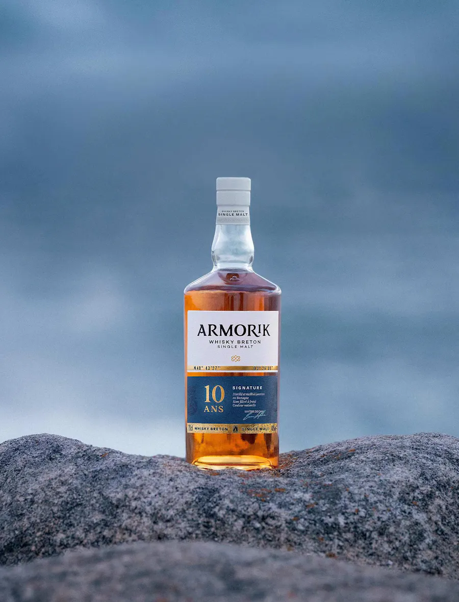
The bottles retain their historic two-label structure, with each label playing a distinct role. This two-part construction separates the brand territory from the individual expression of each whisky.
On the upper label, the brand takes centre stage. A proprietary typeface forms a bold and expressive brand mark, with a deliberately raw design that conveys the strength and rugged character of the land. On the lower label, each whisky reveals its own identity. Illustrations, symbols and graphic details draw on Breton heritage, landscapes and imagery to create distinctive worlds, while maintaining the visual thread that unites the entire range.


The guardian of bonds
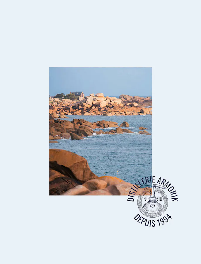
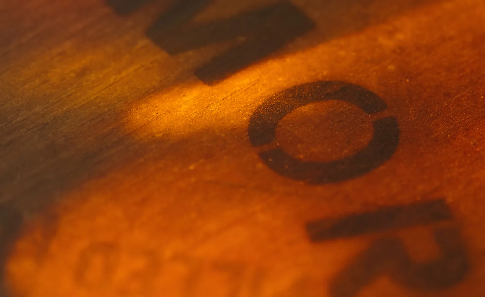
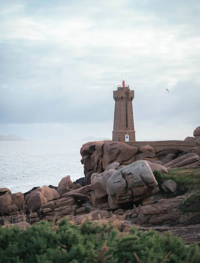
The materiality of the background draws directly from Armorik’s territory: its texture evokes the iconic rock formations of Brittany’s Pink Granite Coast, shaped over time by the elements and the Breton climate. A raw, mineral texture that anchors each bottle in the landscape of its origins.
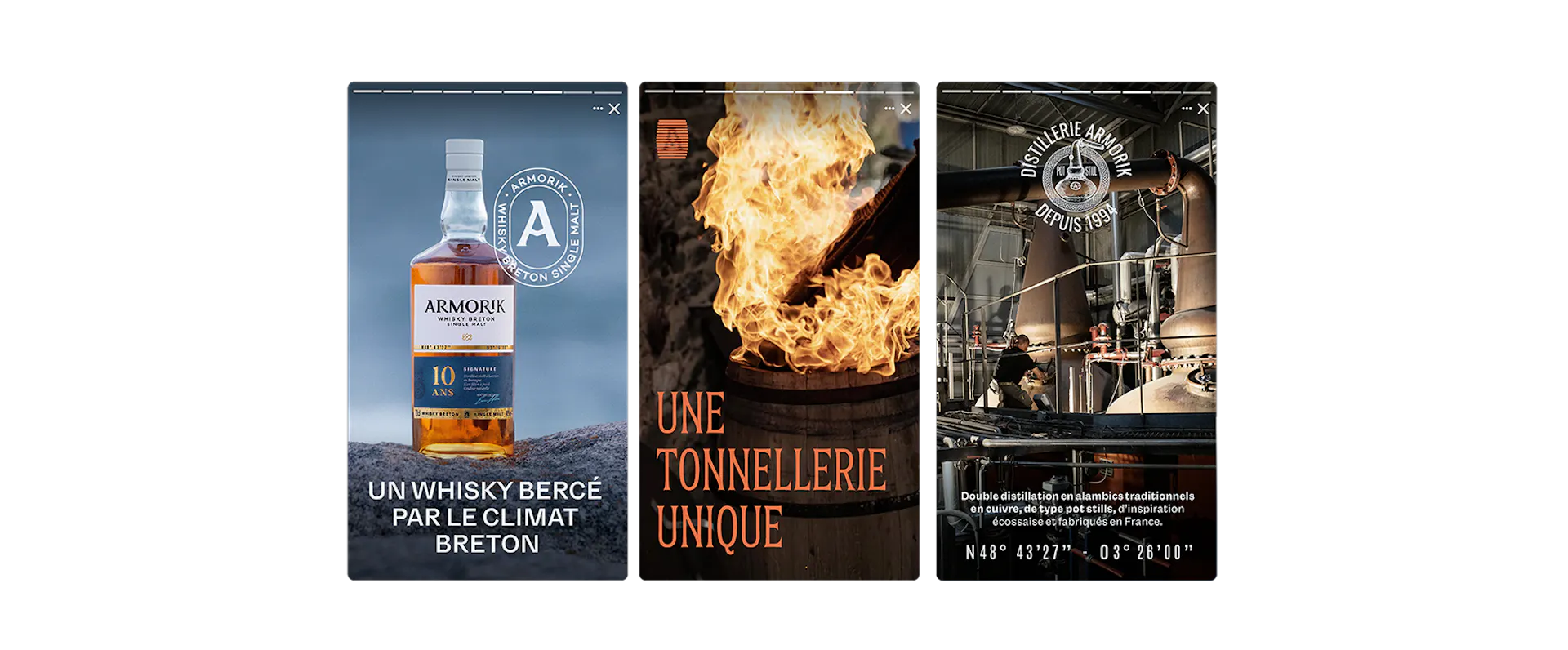
Bringing the identity even closer to Armorik’s DNA and the rugged character of its territory, a wealth of new details enriches the brand’s visual language. At the forefront, the sailor’s knot becomes a new emblem within Armorik’s visual identity. It embodies connection — the bond between Armorik and its land, its history, its savoir-faire, and the women and men who carry it forward. It becomes the guardian of these bonds.

A signature of french whisky
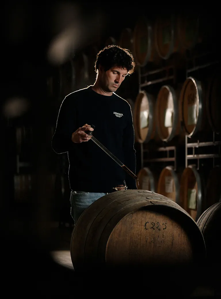
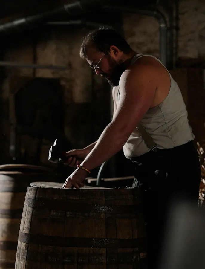
Building on its pioneering status and more than thirty years of experience, Armorik can now express its savoir-faire through a collection of age-statement whiskies: 10, 15 and 18 years old. Three expressions conceived as a progressive journey into the heart of what makes Armorik so distinctive. Here, time meets the sea and Brittany’s ever-changing, rugged climate, shaping the character of the whiskies just as it shapes the women and men who craft them.
Today, we are proud to see Armorik stand among the leading names in French whisky, driven by the same unwavering conviction: to fully embrace who we are. A Breton whisky, sculpted by its climate.