Journey through the Uruguayan vineyards…
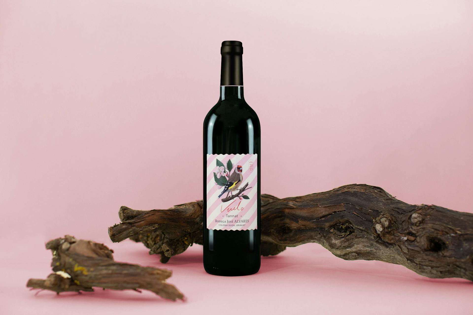
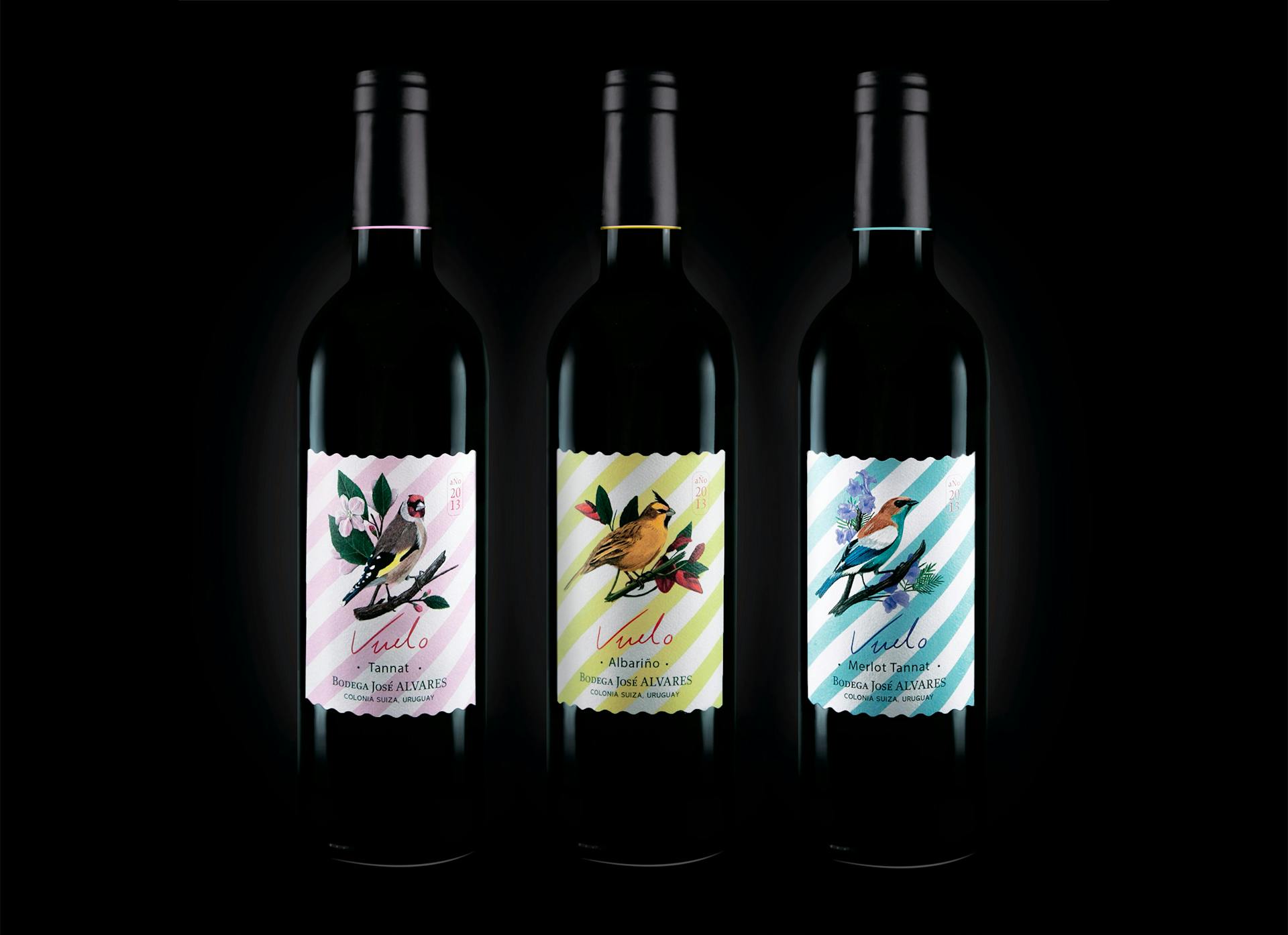
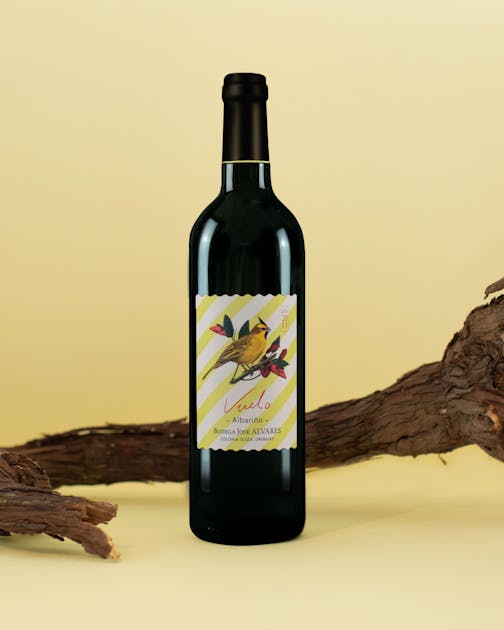
This location first discovered during a trip, is at the origin of our creative process and our concept for this wine producer. The general form is inspired by the formal and graphic codes of the postage stamp.
And what better ambassador of travel is there than this stamp affixed to the back of a postcard with somewhat atypical decorations? It is from this small piece of paper, a kind of witness to the cities and the settings that were explored, that our Parisian studio first began working on a concept for 3 labels.

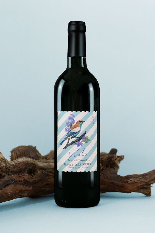
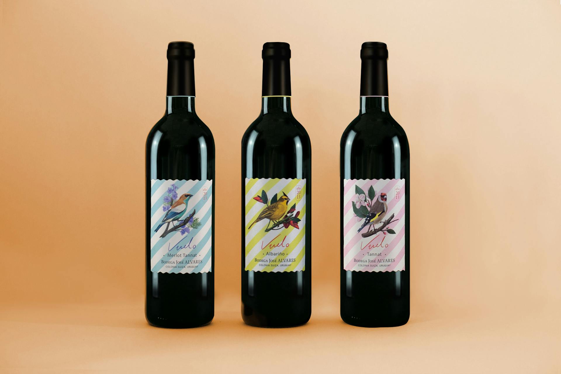
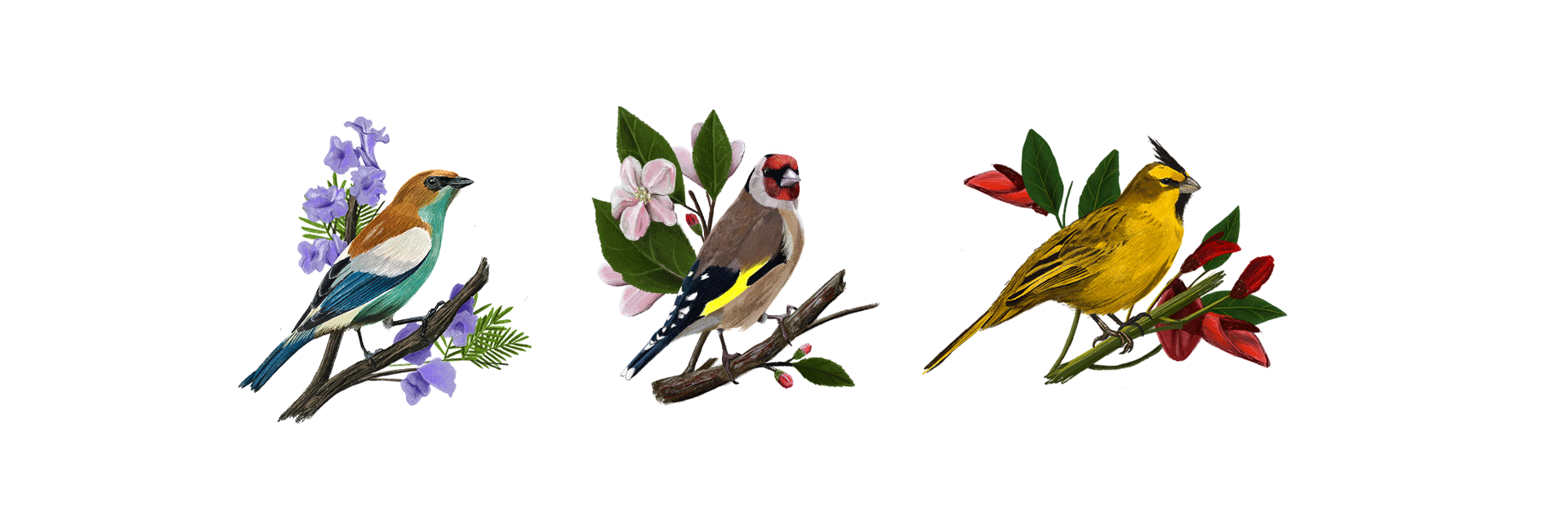
Like impressionist painters, we took out our easels and drawing boxes and went to work exploring the terrain. From this on-the-spot research, we were inspired by the local fauna and flora to produce these threeneo-authentic themed label designs. In the foreground of these graphic compositions, there are three illustrations of a bird on a branch, with a deliberately naive, sketch-like treatment—a nod to the graphic style of 70s wall hangings and wallpaper.
In the background, there is a motif used to enhance and contrast with the delicate drawings of the birds. The diagonal bands come from the desire to reinterpret the aesthetic codes concerning post-marks. A true passport illustrating our journeys, connections and experience of international escapism, this post-mark motif, normally overlaying the stamp, now becomes a participatory element of the graphics of our project.