Modernity vs tradition
Oban, a picturesque town located on the west coast of Scotland, is often called the "gateway to the isles" due to its strategic geographic position, making it an ideal starting point for exploring the Hebrides. Founded in the 18th century, Oban has a rich maritime history and was long a crucial center for fishing and trade. Today, it is also renowned for its Scottish cultural heritage, particularly its iconic whisky.
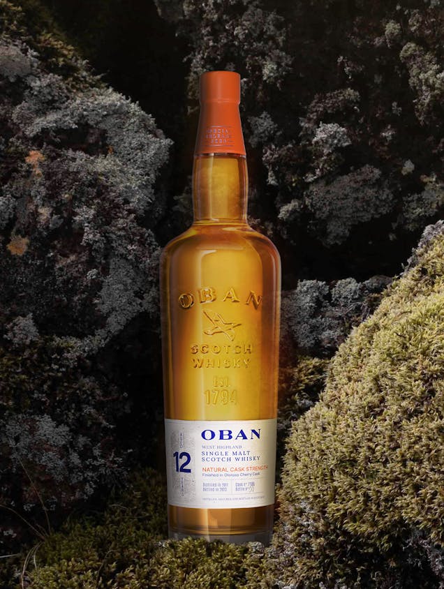
The Oban Distillery, one of the oldest in Scotland (founded in 1794), seeks to tell its story through a traditional visual identity. The work of Studio Boam has highlighted the distillery's storytelling in a contemporary and impactful manner.


The embossing on the glass bottle elegantly highlights the OBAN logo. This engraving at the top of the glass allows the label to stand out freely at the bottom, thus creating two distinct and structured visual zones.
The slightly textured paper, combined with embossing and hot stamping techniques, gives the product an authentic and premium look. These details also evoke the texture of the rocks found in the region, reinforcing the connection to Oban's terroir.

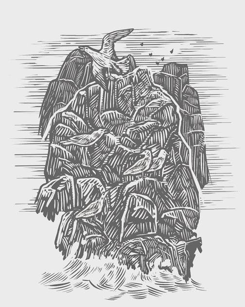
The logo has been simplified and modernized, both in terms of illustration and typography. The seagull, now facing forward, symbolizes this evolution.
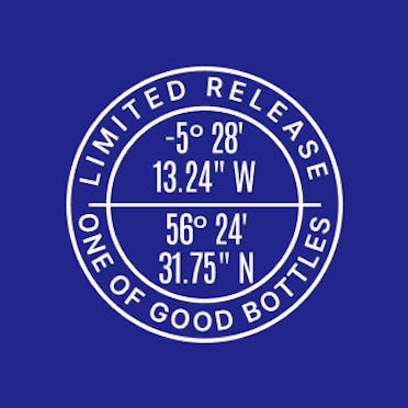
Additionally, the blue and orange colors have been intensified to give the label more depth.

A visit to Oban and its distillery offers a rewarding experience, ideal for whisky enthusiasts and lovers of Scottish landscapes.